Creating a Distinctive Brand for the Digital Nomad Experience
About
Wandra
Wandra was a software platform built to streamline the digital nomad lifestyle. Starting with visas and relocation logistics, it brought together a digital visa process, destination insights, and access to essential services for people living and working across borders.
Wandra needed to stand apart from the conventional language of travel brands while creating an identity that felt relevant to the flexible, international lifestyle of its audience.
What We Delivered
Every decision was made to help Wandra feel more welcoming, recognizable, and relevant to its audience.
Brand Identity
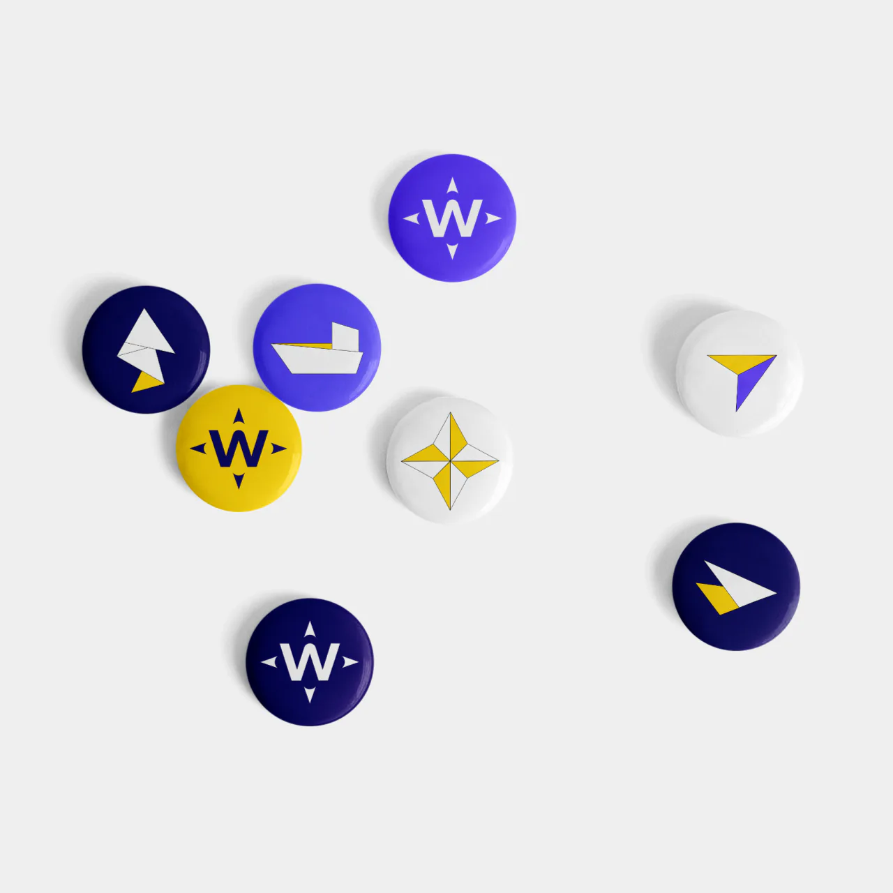
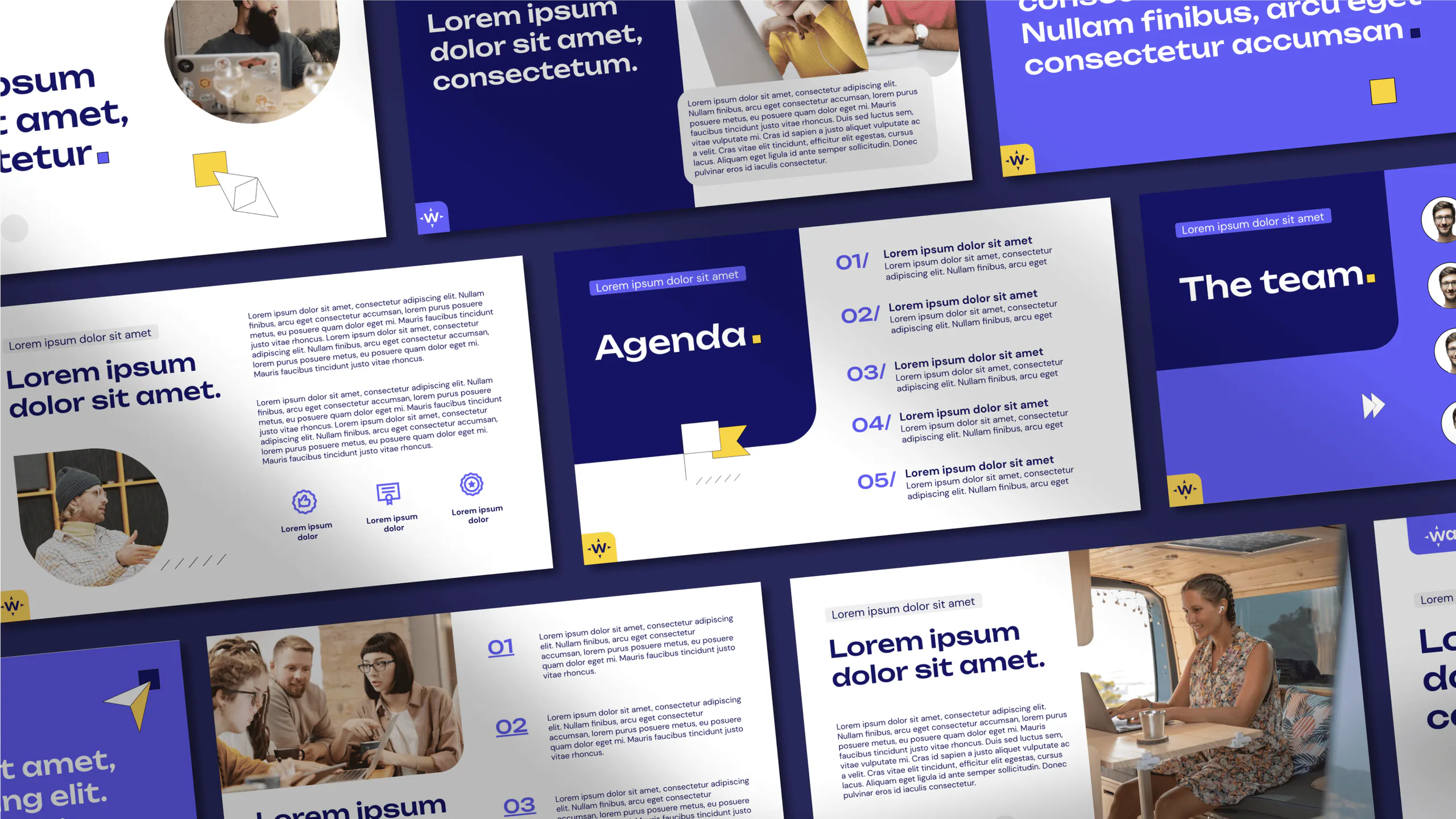
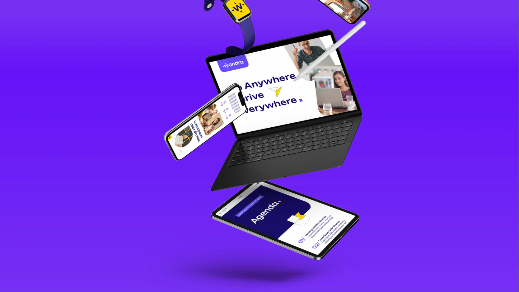
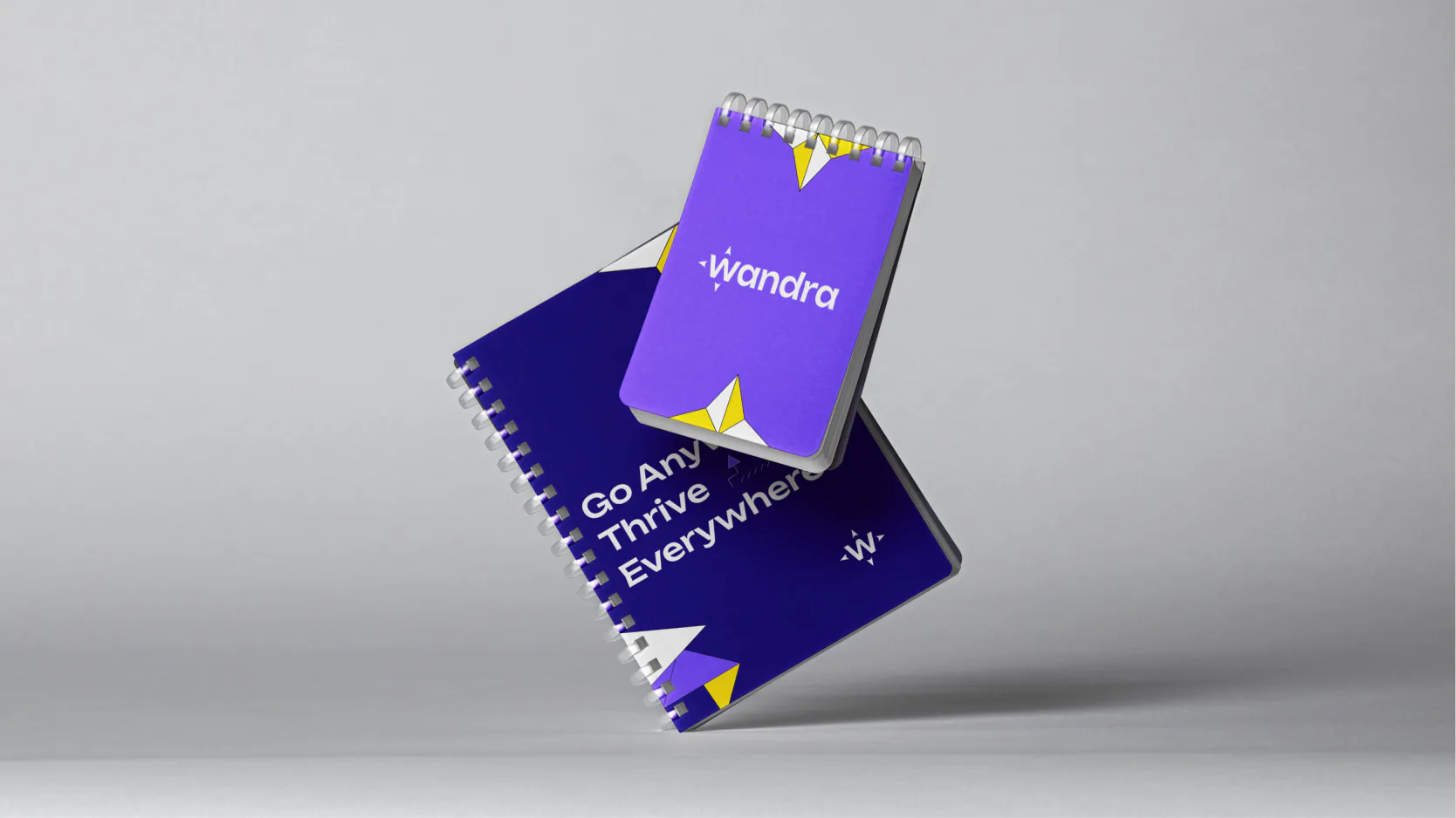
We developed a flexible visual identity inspired by movement, exploration, and the freedom associated with location-independent work. The system was designed to give Wandra a recognizable personality while remaining versatile enough to grow across future applications.
Logo design
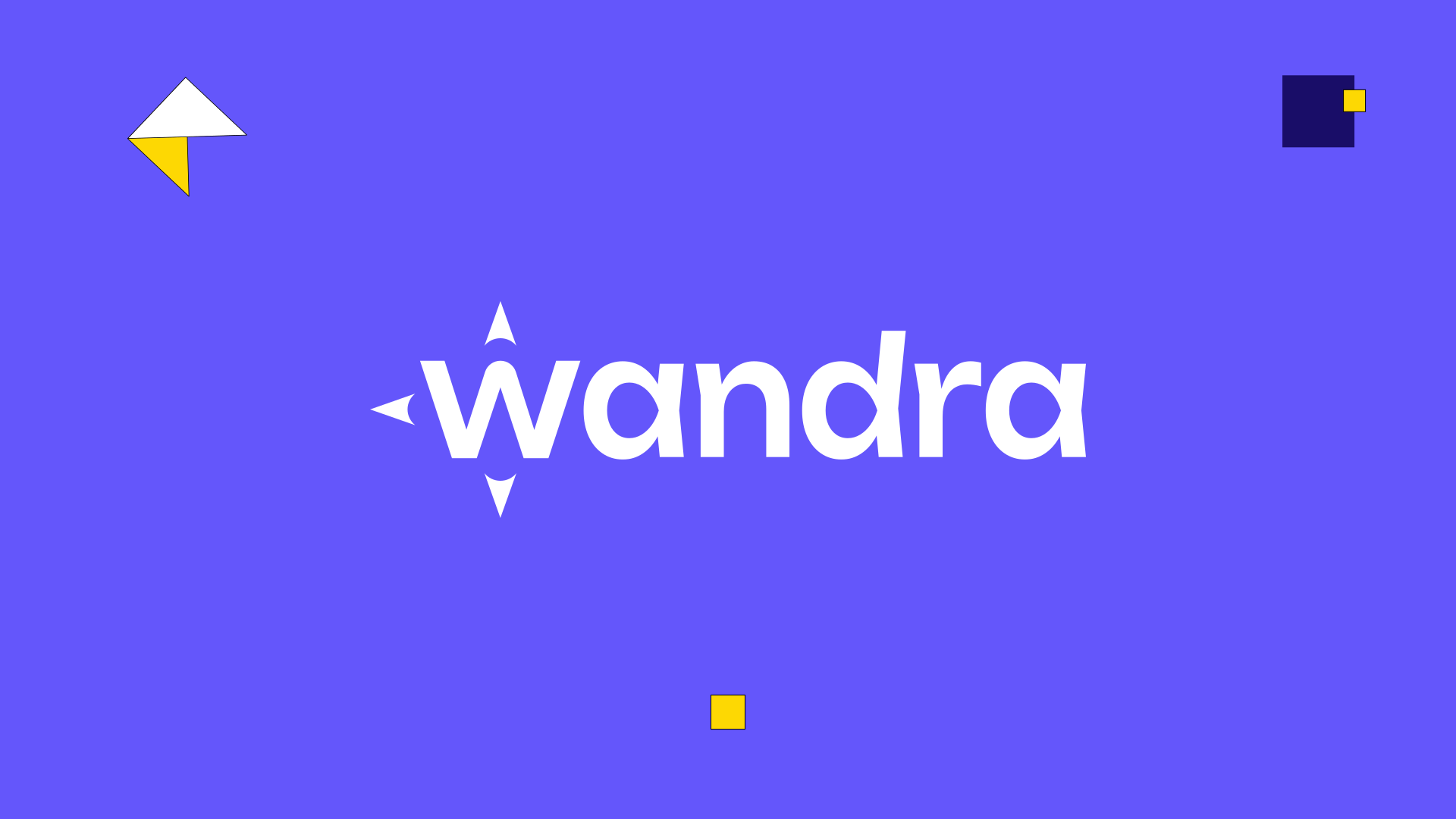
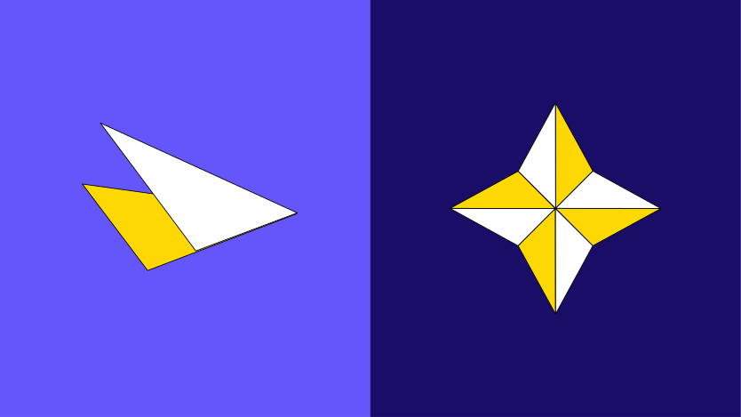
We translated the ideas of movement and exploration into a simple, recognizable mark that could become a consistent anchor for the wider visual system.
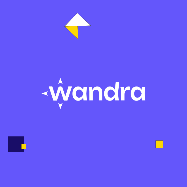
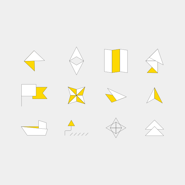
Illustration system
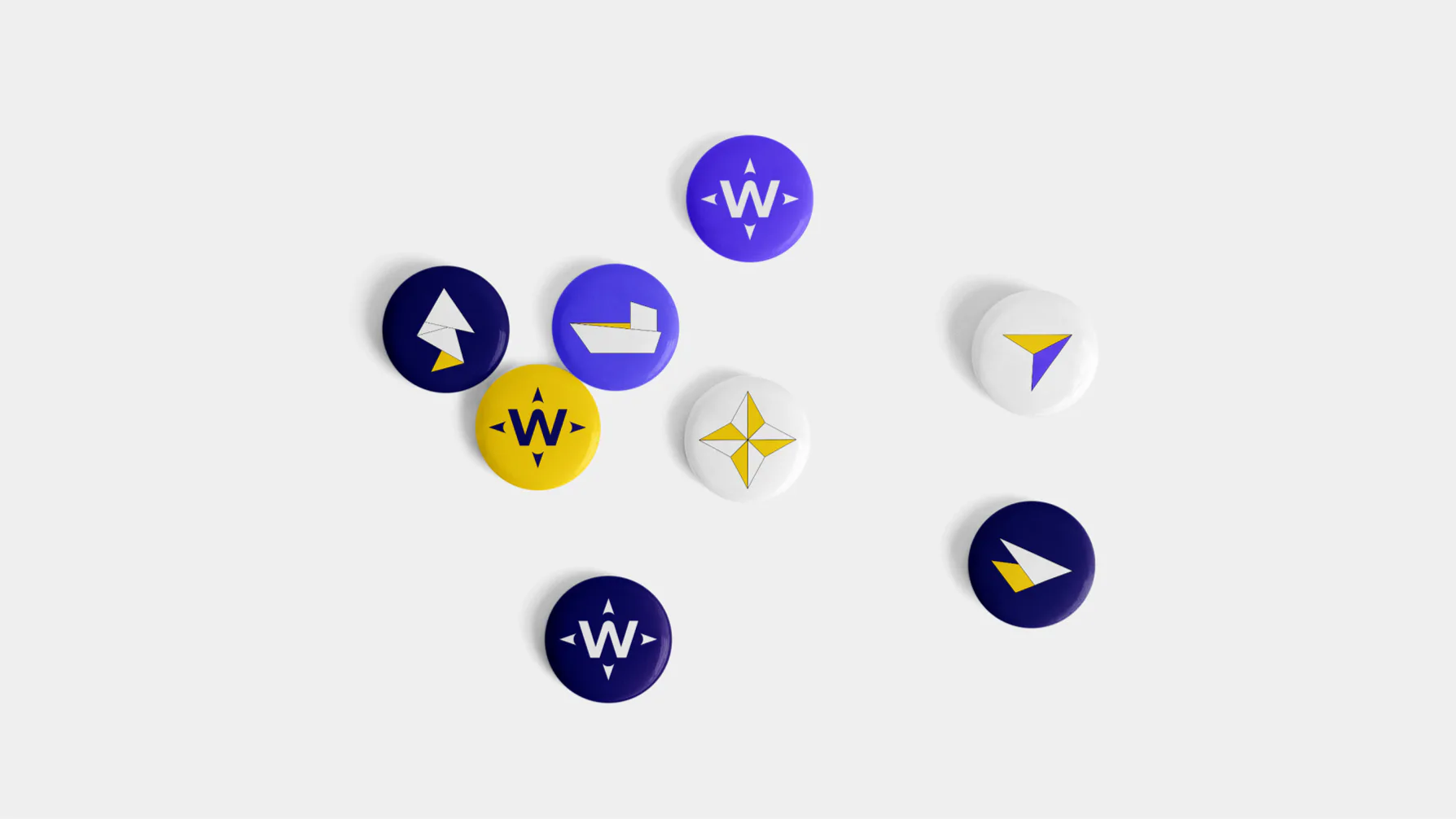
We created a custom illustration language that extended the identity beyond the logo and gave Wandra a more expressive way to communicate destinations, experiences, and services across different touchpoints.
The end result
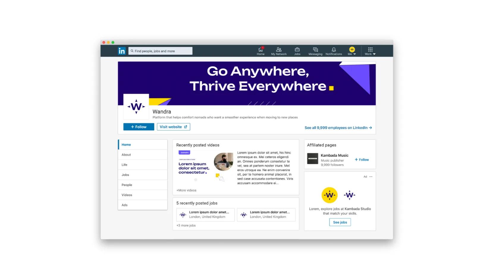
A vibrant and approachable brand identity that helped Wandra stand out and connect more naturally with digital nomads.
Results that matter
Stronger differentiation
More audience alignment
A more ownable system
Does your brand still reflect where your company is going?
Tell us where you are today and what you want to change. We’ll take a first look and share where design could make the biggest difference.
Explore more