Turning a MedTech Service Into a More Professional and Trustworthy Experience
About
TechNurse
TechNurse brings healthcare professionals and medical device companies together to co-create safer, smarter devices. Their platform helps companies gather feedback and testing from qualified medical professionals, while giving healthcare staff the opportunity to contribute their expertise in a practical and rewarding way.
Despite the team’s efforts, sign-ups remained low. We realized the challenge was bigger than the flow itself: people needed to understand and trust the company first, which meant creating a more professional and coherent experience across key touchpoints.
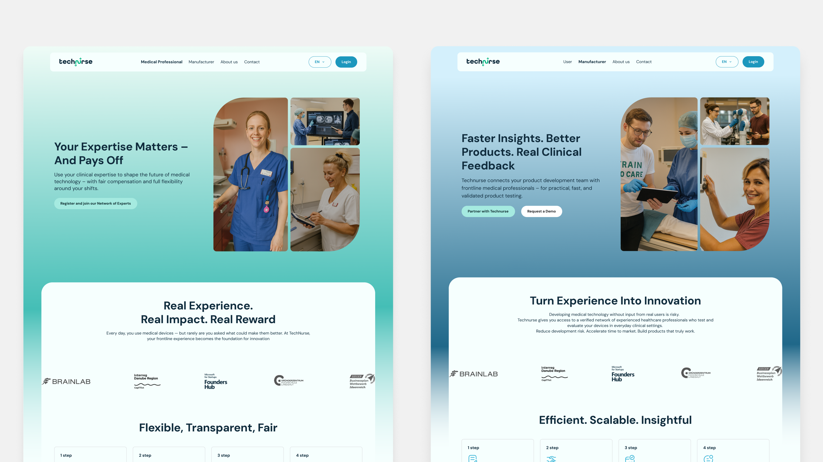
Before and after
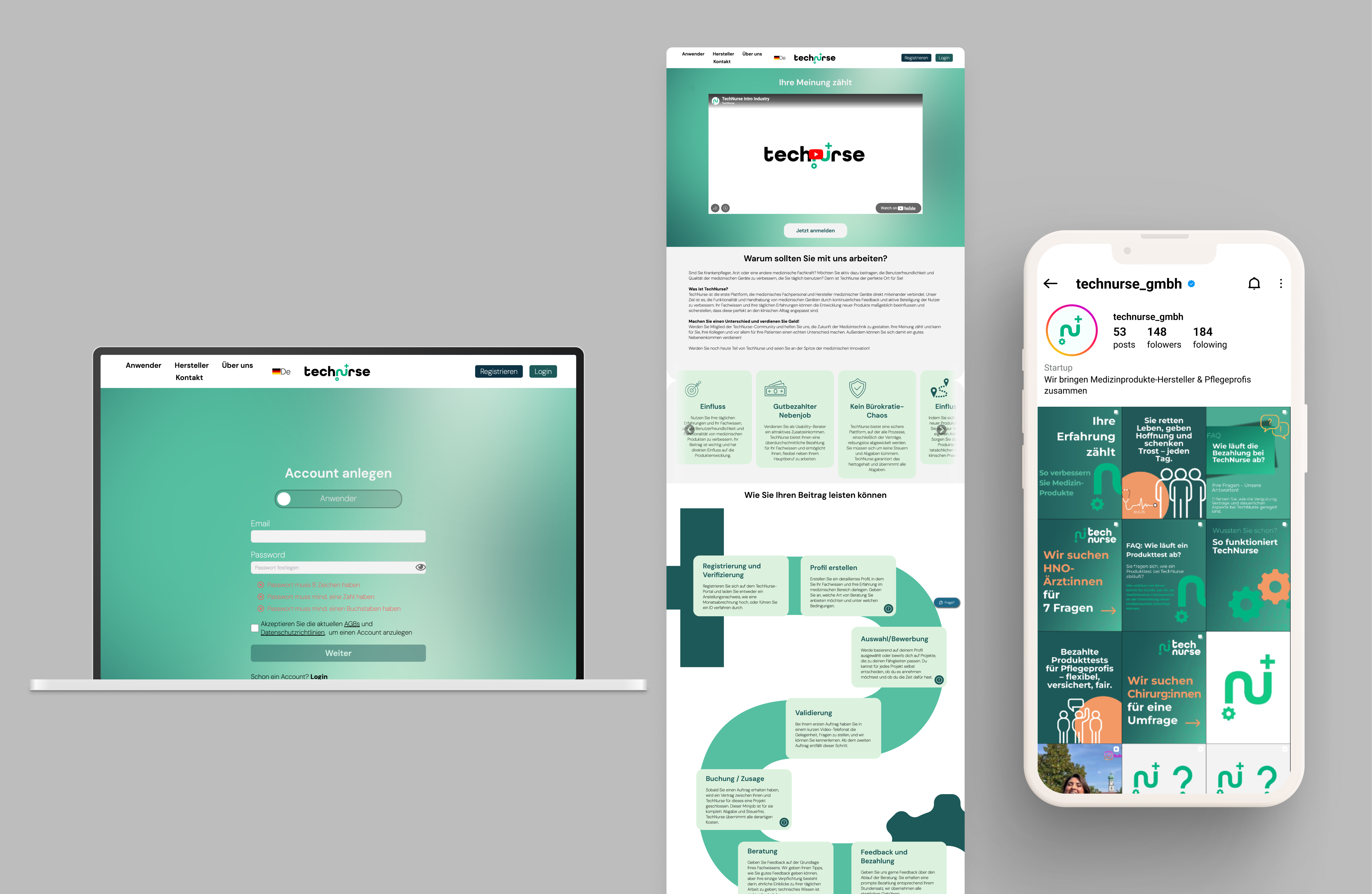
What We Delivered
Every decision was made to help TechNurse communicate more clearly, look more professional, and improve conversion across the user journey.
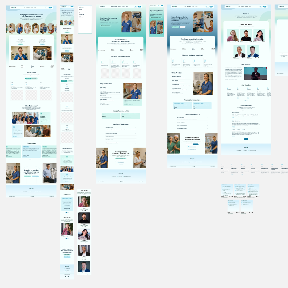
Website redesign
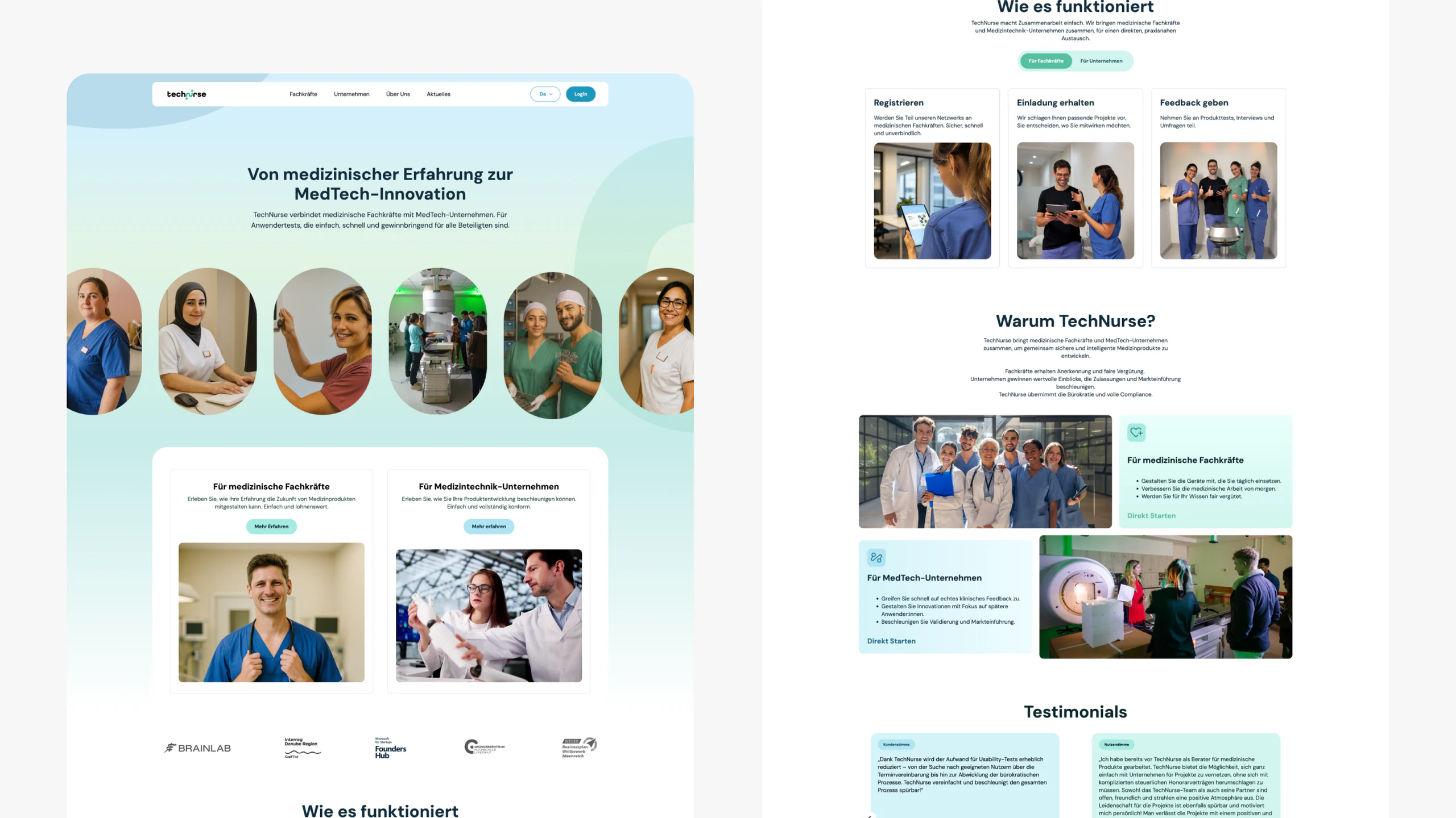
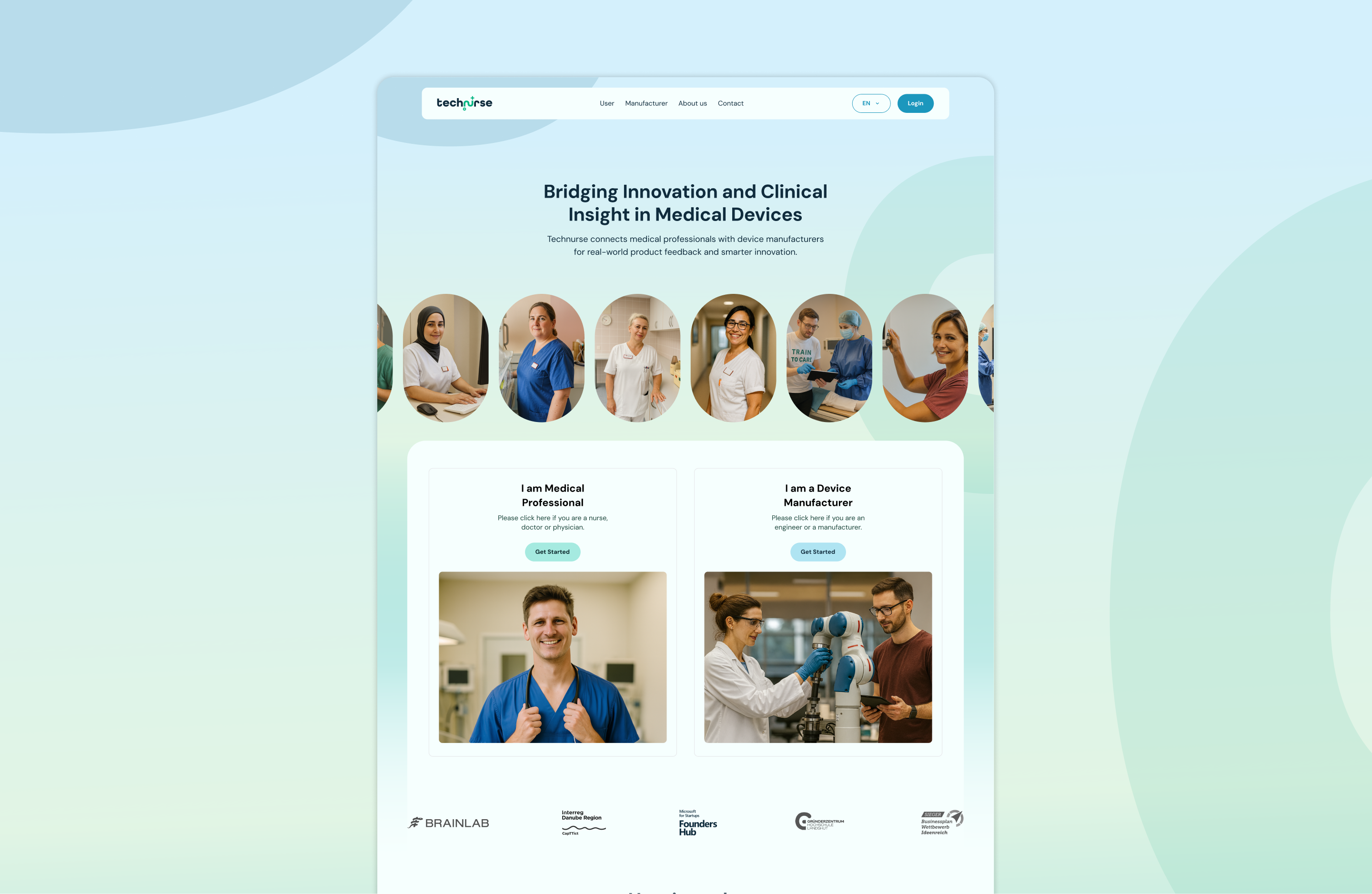
We redesigned the website to make the offer clearer and more trustworthy from the first interaction. Because TechNurse addresses two distinct audiences, we shaped the experience accordingly: a more approachable tone for healthcare professionals and a more formal, trust-building tone for companies.
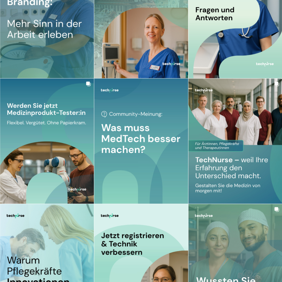
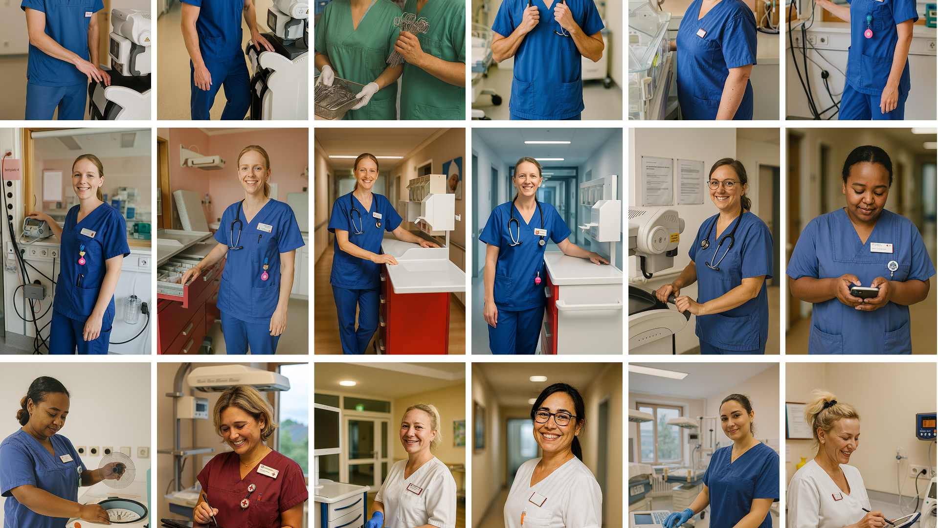
As there was no strong image library at the start, we developed AI-generated visuals based on real clinical professionals in Germany. This helped create a more authentic and immediately recognizable context, making the platform easier to understand at a glance and more relatable for Fachkräfte. We also refined the messaging to highlight the benefits most relevant to them.
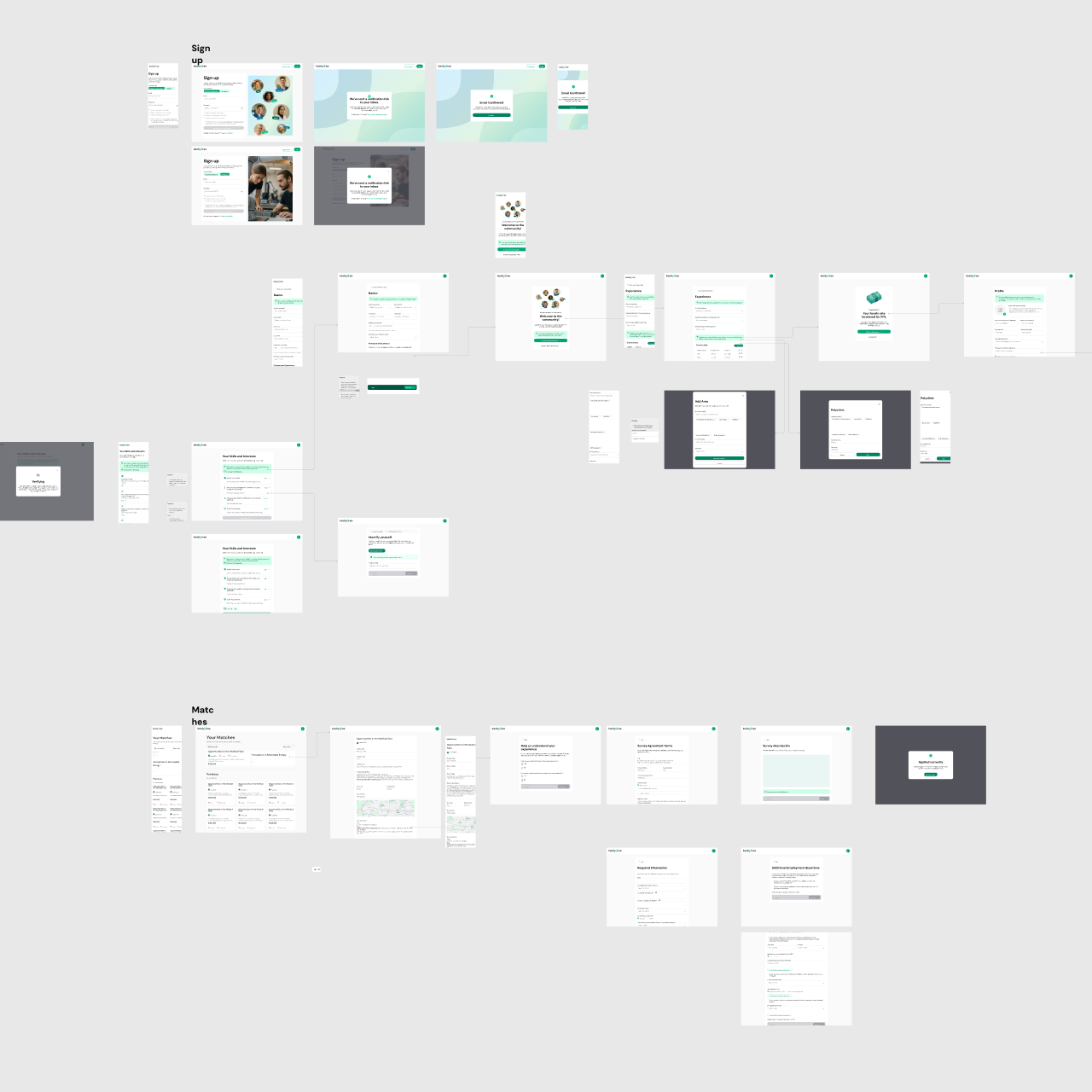
Sign-up flow redesign
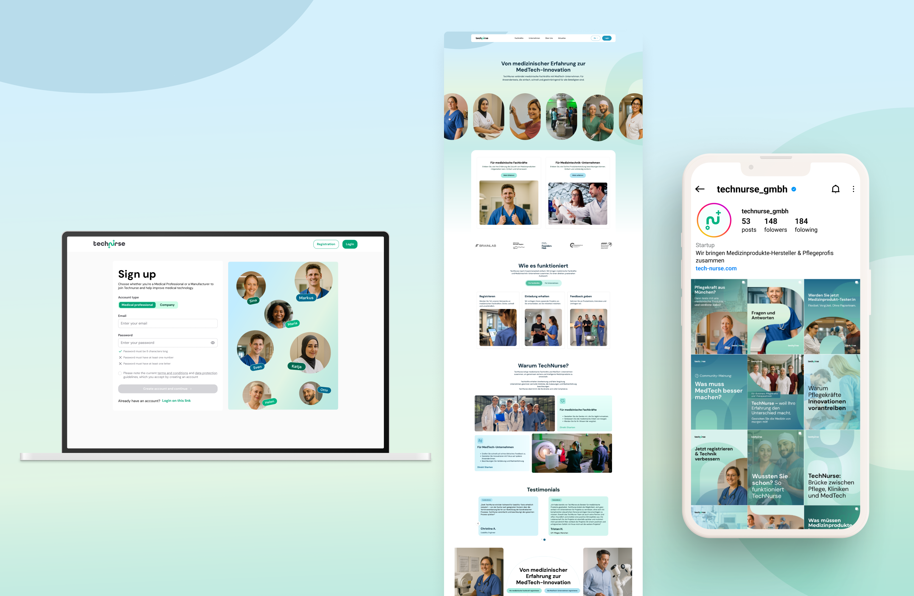
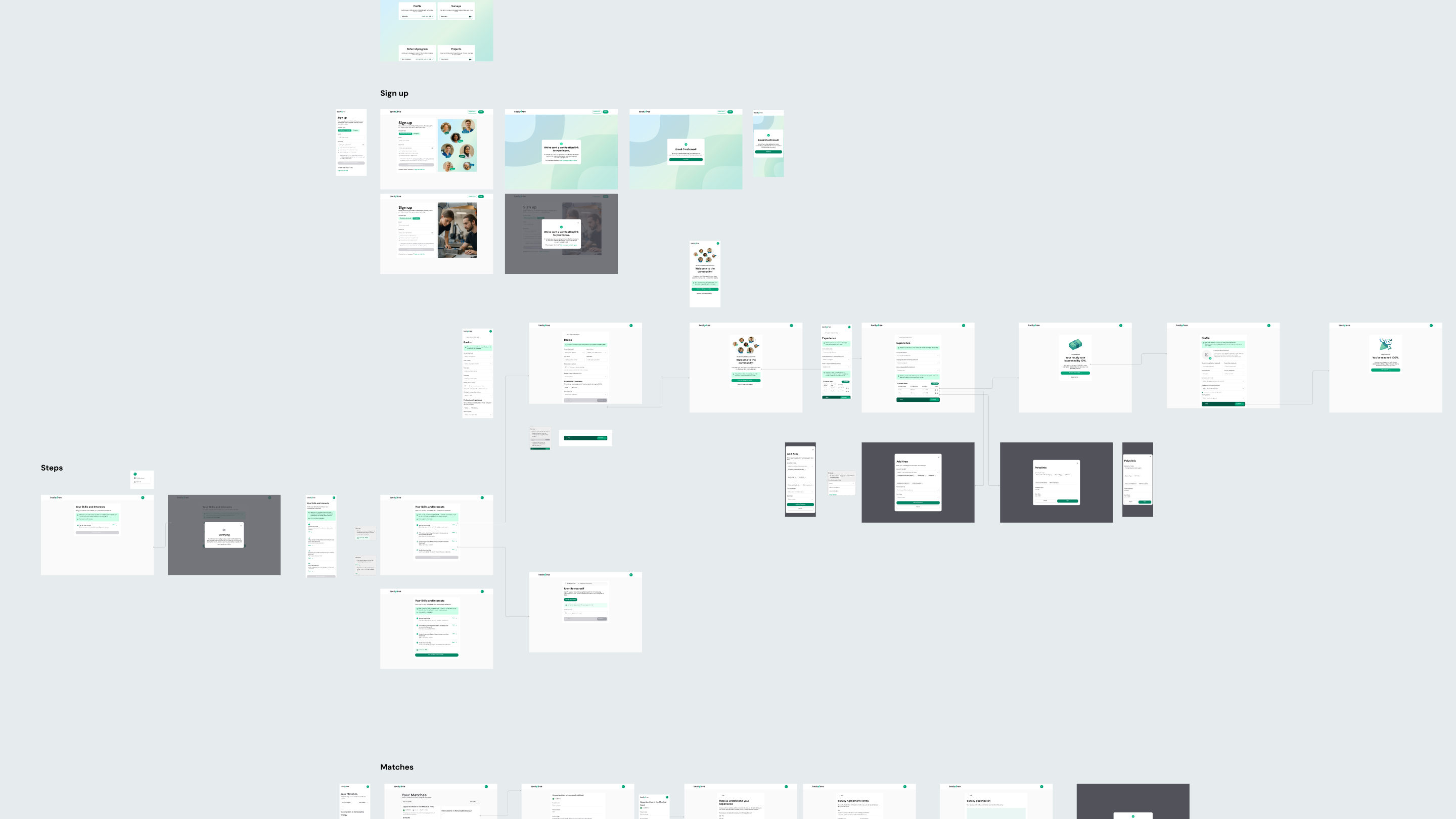
We redesigned the registration flow to make it shorter, clearer, and easier to complete. Through UX/UI improvements, we reduced friction in the step-by-step process and created a smoother onboarding experience that led to a significant improvement in conversion.
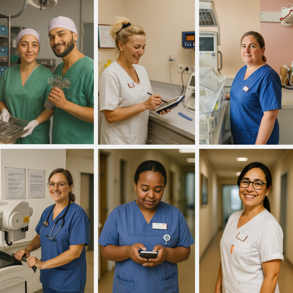
AI-generated visual direction
Because no suitable image library existed at the start, we created AI-generated visuals based on real clinical staff and real-world healthcare contexts in Germany. This gave TechNurse a more authentic and recognizable visual language, making it easier for the target audience to identify with the brand at a glance.
Brand consistency across communication
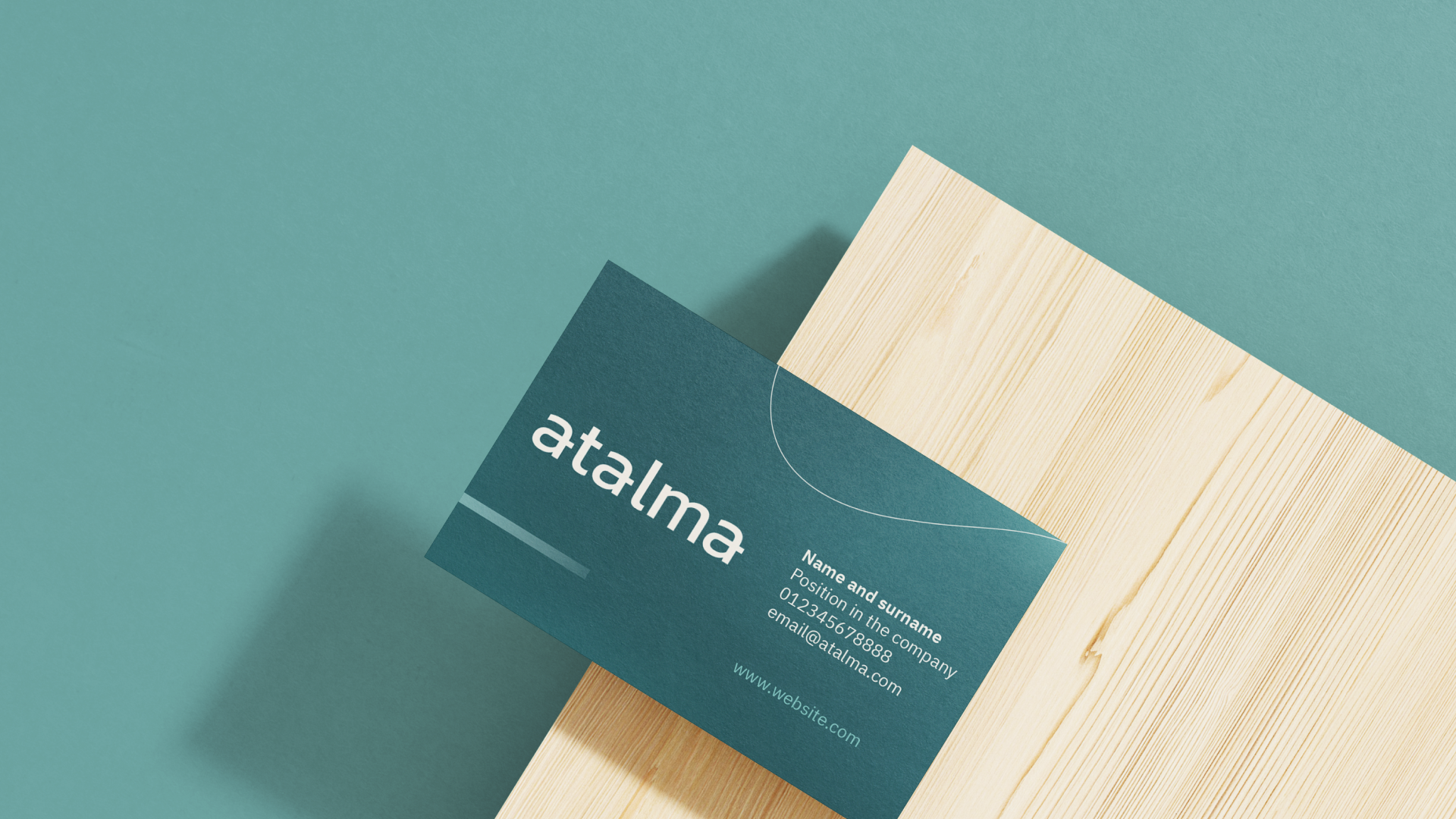
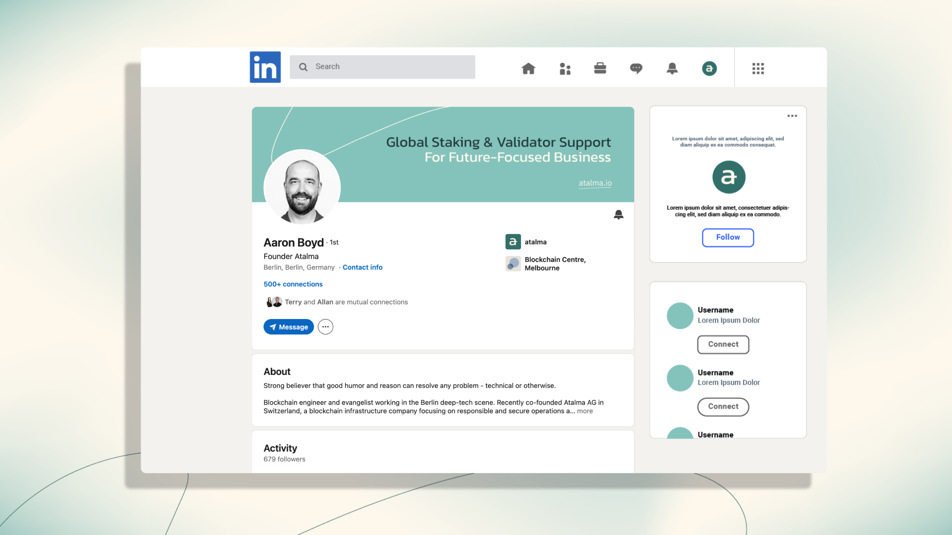
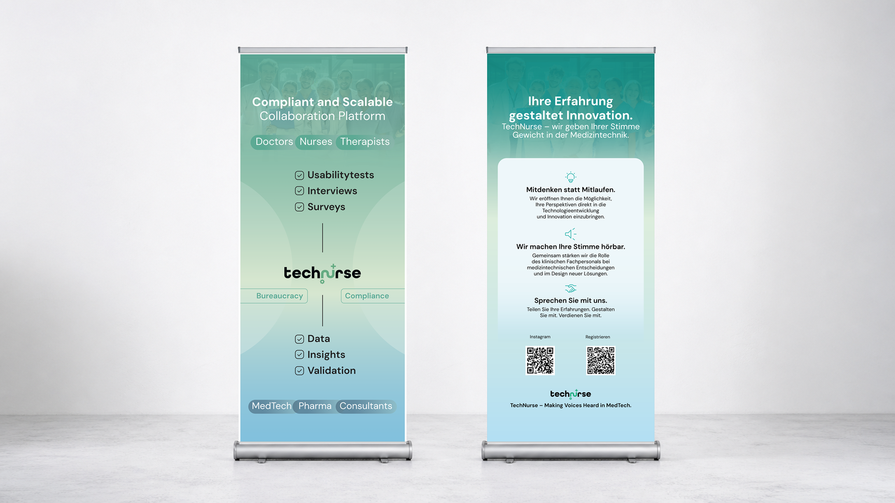
We reviewed TechNurse’s communication across social media and identified the need for stronger visual consistency. To support that, we redesigned their pitch deck in a more on-brand and visually engaging way, and developed supporting materials such as roll-ups. This helped create a more coherent and professional presence across key communication touchpoints.
The end result
A more professional and consistent brand experience that helped TechNurse build trust, communicate more clearly, and improve performance across key touchpoints.

Results that matter
150% increase in visitors and retained users
Lower friction, stronger conversion
Greater trust across touchpoints
Gaby and her team at Tukuna Studio have been exactly what we needed. After a string of disappointing agencies, I had honestly already given up. But I’m glad we gave it another shot after receiving a recommendation for her. She has already supported us with four different projects, proving that Tukuna can consistently deliver. What stood out most to me is the expertise and care they bring in thinking through the communication for our users at every step. If you’re looking for someone who is excellent at getting a message across through design while keeping projects on track and in scope, I can truly recommend her.


When trust depends on every touchpoint, design needs to do more than look good.
We help growing companies create clearer, more credible experiences from first impression to conversion.