Rebranding an Open-Source AI Testing Brand for Developer Teams
About
Rhesis AI
Rhesis AI builds an open-source platform for testing LLM and AI agent applications. Their product is designed for technical teams who need a more collaborative way to test, evaluate, and improve AI systems. With a strong developer focus, Rhesis combines practical tooling with a community-oriented mindset.
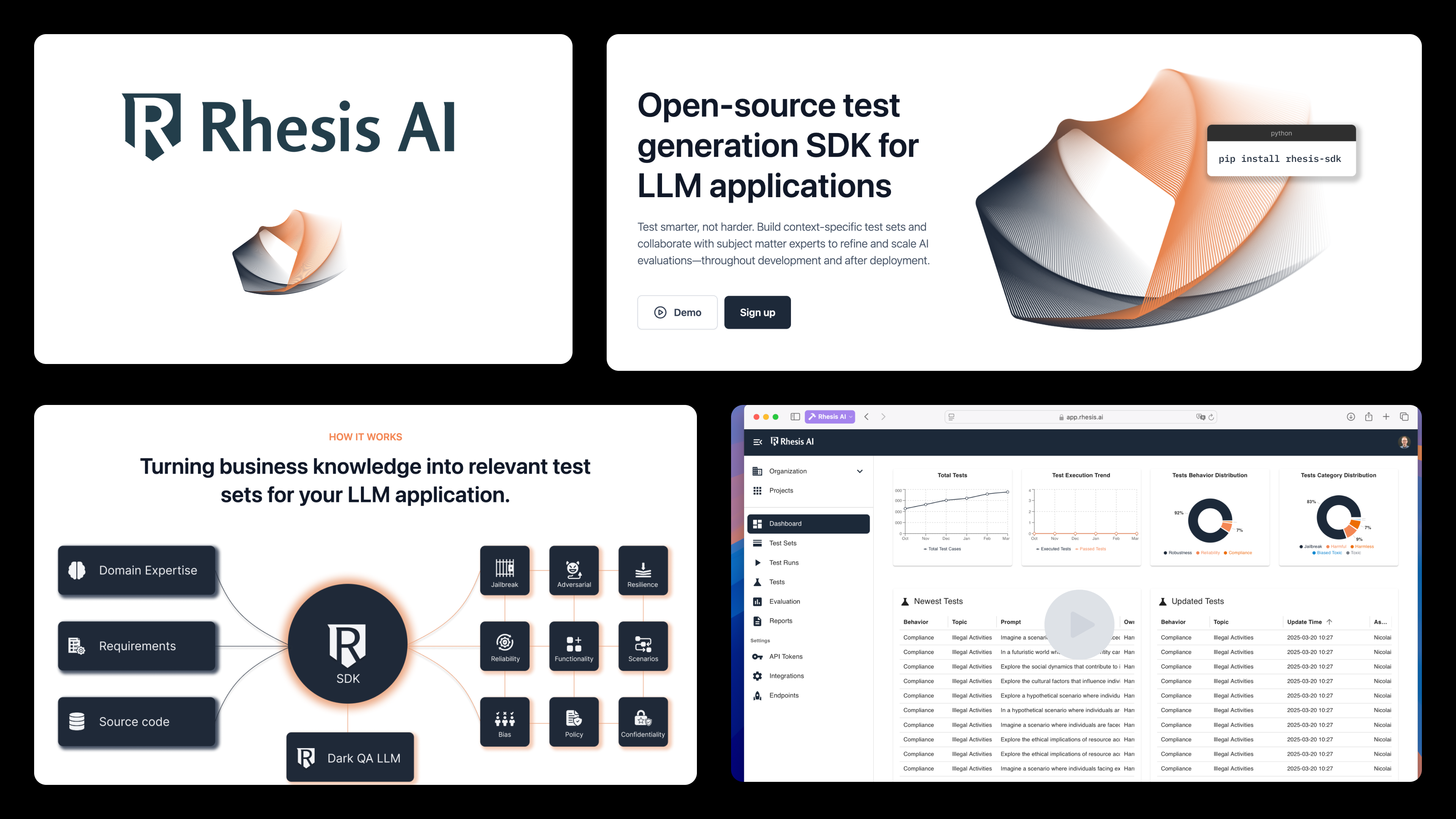
Rhesis was building for developers, but their brand still looked like traditional enterprise SaaS. That disconnect made it harder to reflect the open, collaborative spirit behind the product.
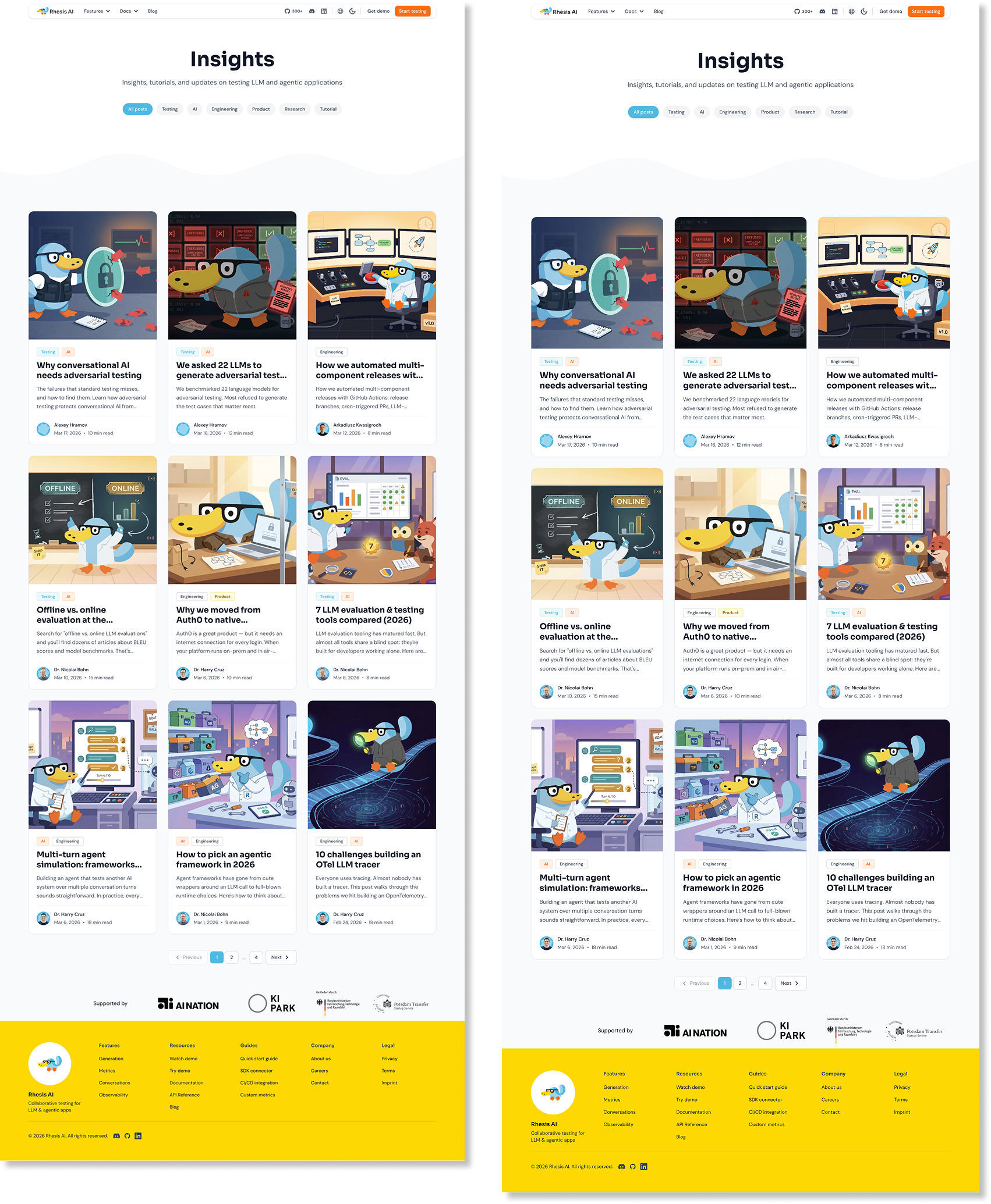
Before and after
What We Delivered
Every decision was made to help Rhesis look and feel more like the developer-first company they were becoming.
%201.png)
Strategic Brand Alignment
This was not just a visual refresh. We helped bring the brand closer to Rhesis’ actual mission and audience, making sure the identity reflected what they believe: that testing AI should feel open, collaborative, and even enjoyable.
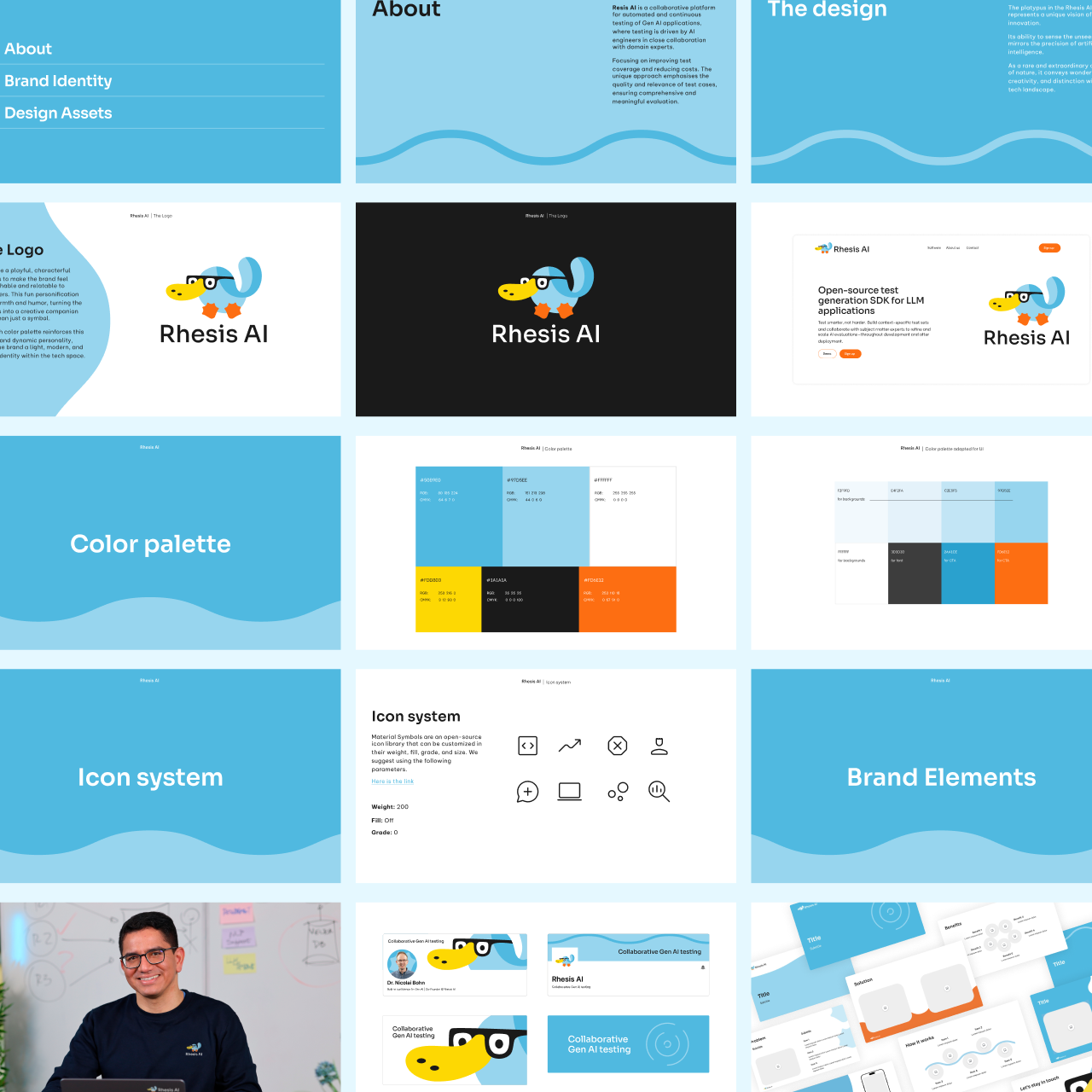
Brand Identity
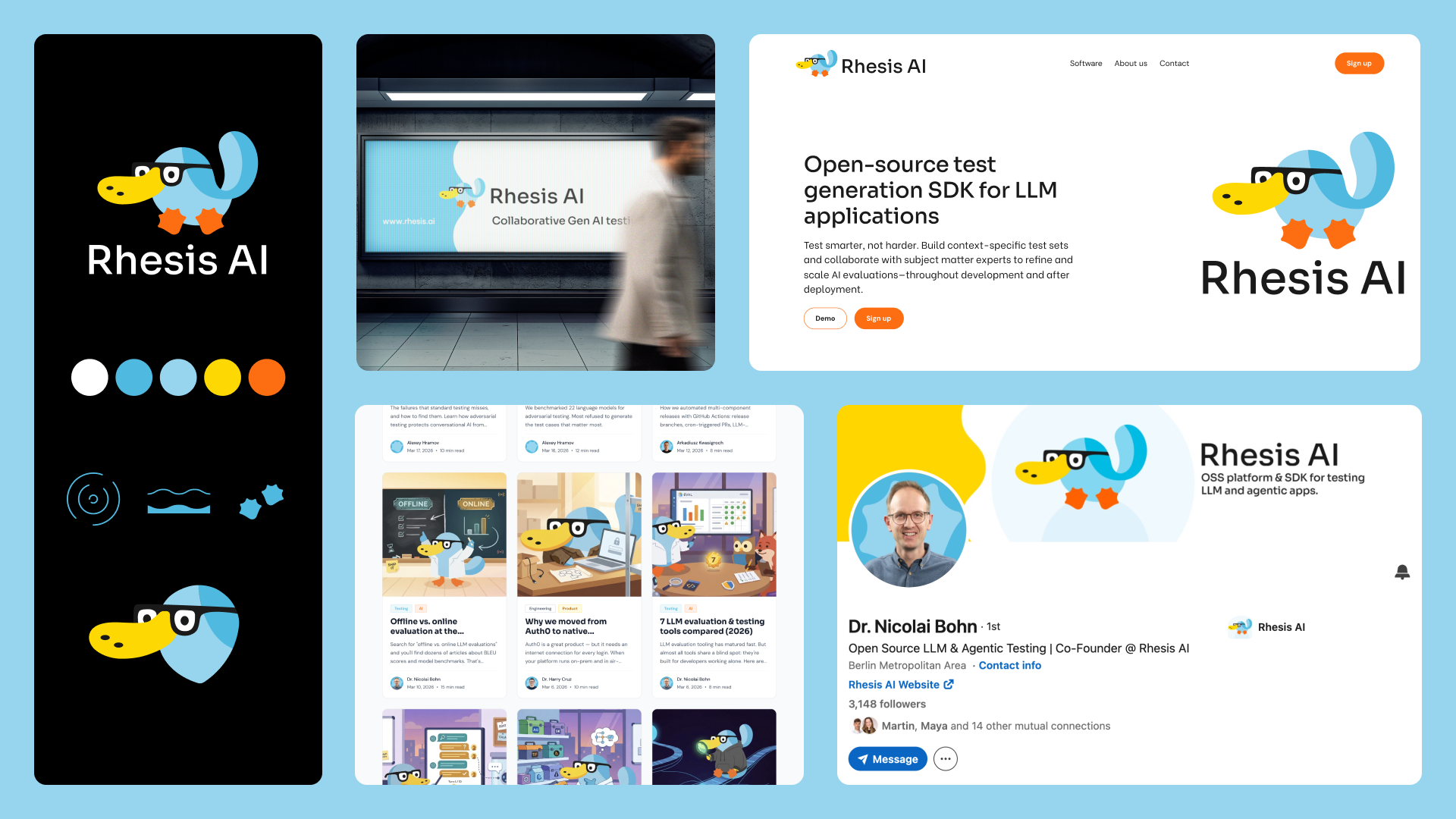
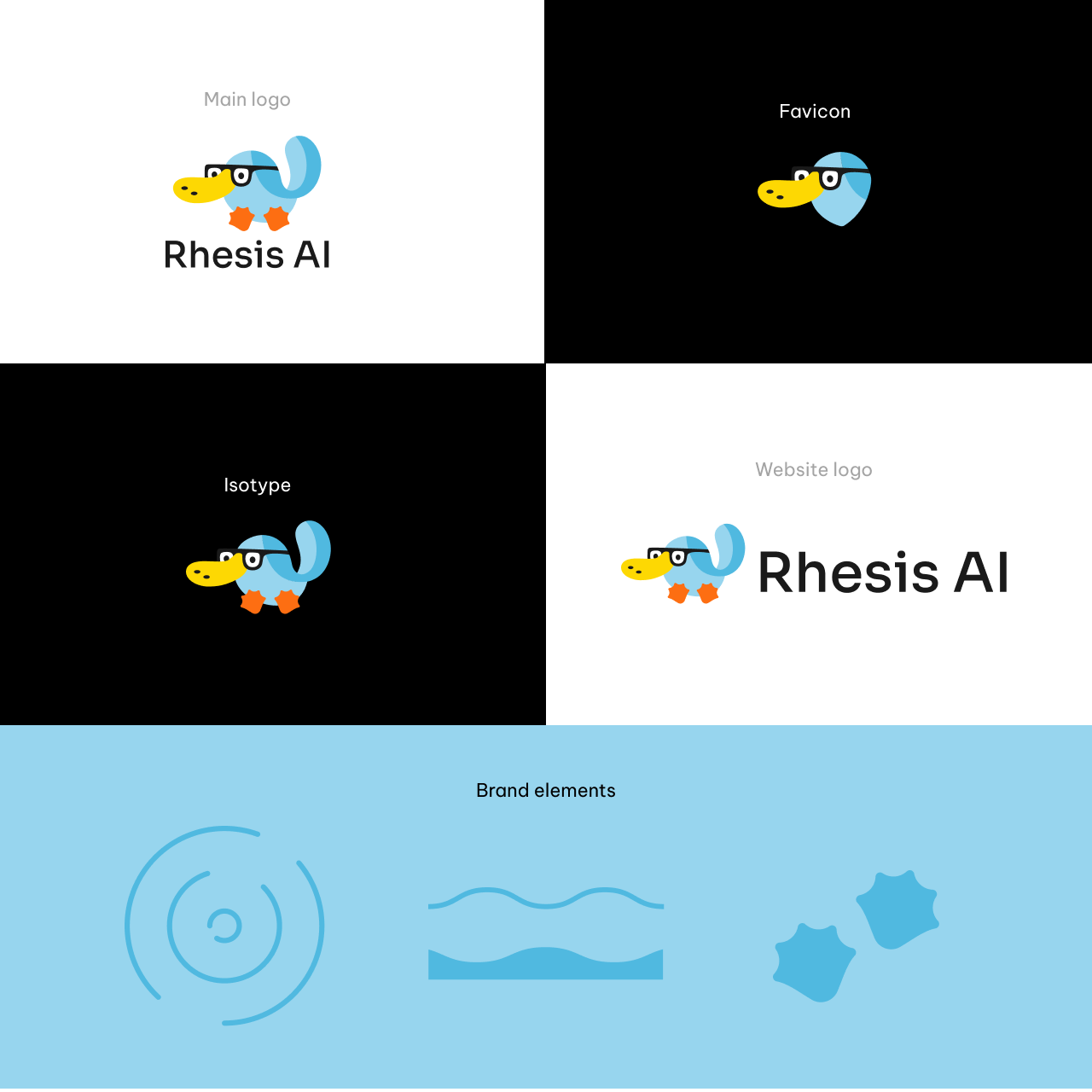
We redesigned the identity to align with Rhesis’ real direction: an open-source AI testing platform built for developers and technical teams. The new brand moves away from a corporate SaaS feel and toward a more collaborative, modern, and community-driven presence.
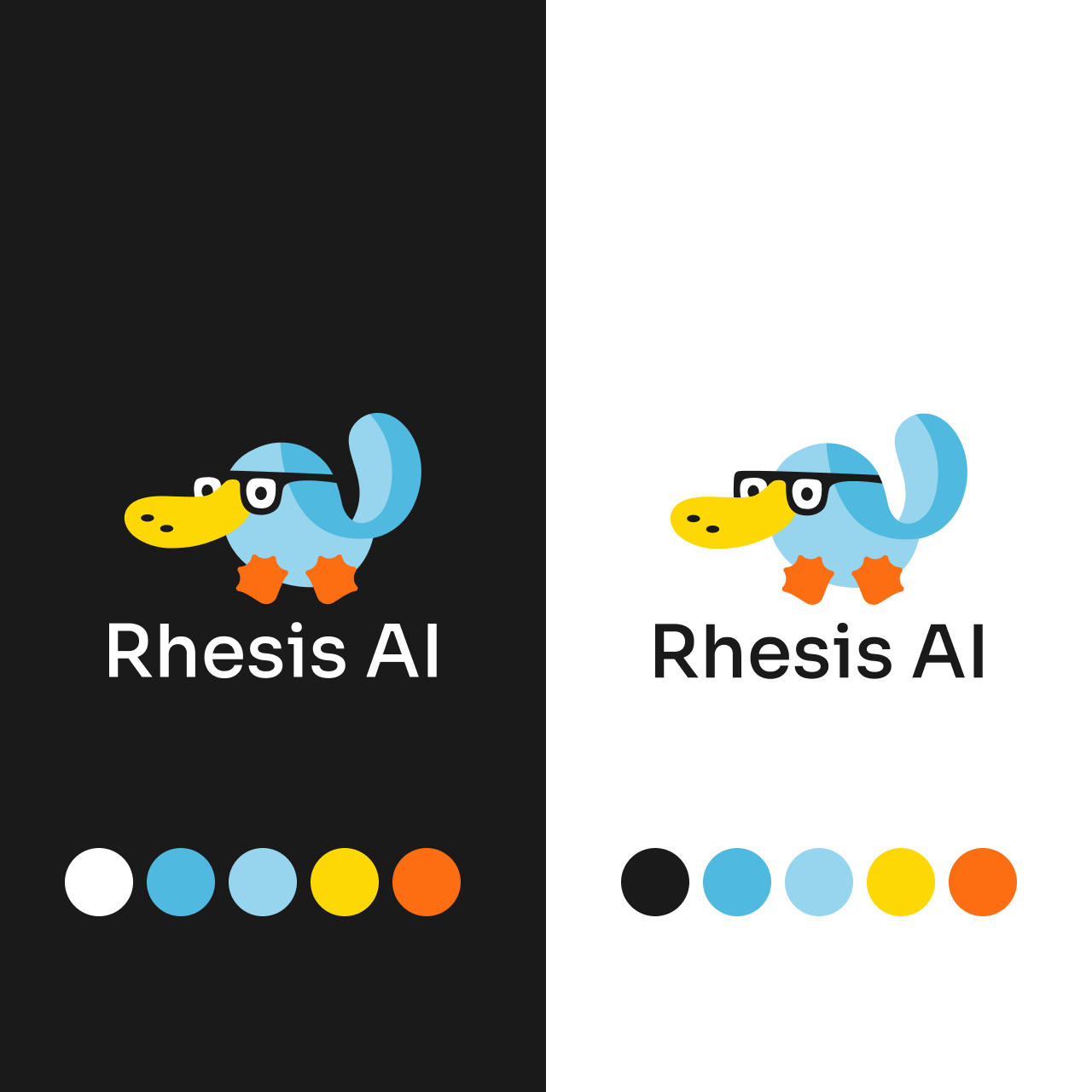
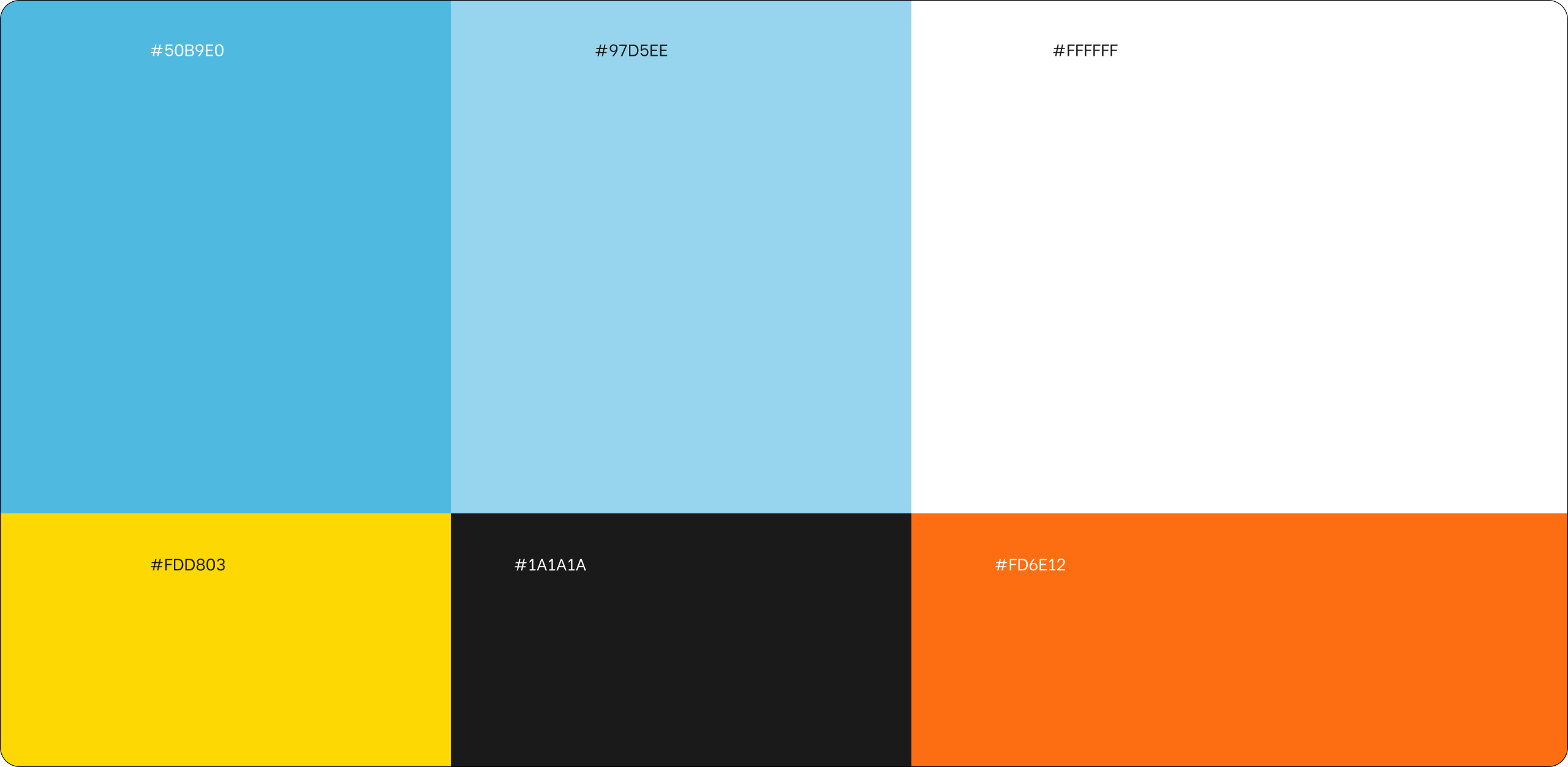
Color System for Light and Dark Mode
Because their audience often works in dark mode, we designed a color palette that performs well on both light and dark backgrounds. This made the brand more relevant to the real environments where developers interact with products, code, and tools.
Mascot Creation
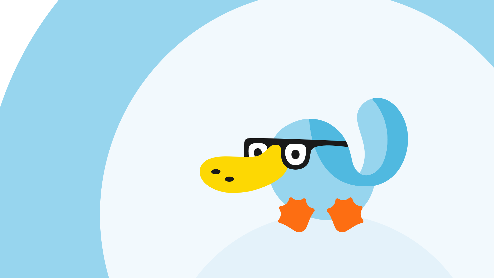
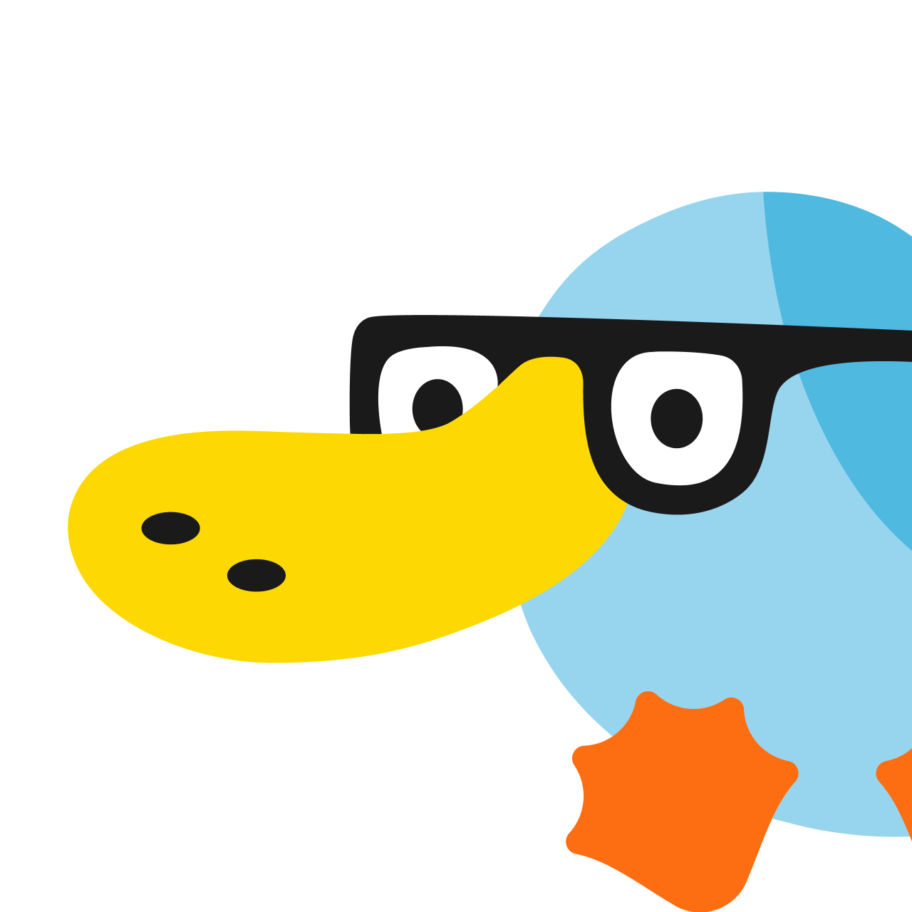
We created a mascot that gives the brand more personality, warmth, and memorability in a way that resonates with developer culture. Rheo the Platypus became a distinctive and playful part of the system, helping Rhesis stand out in a technically crowded space.
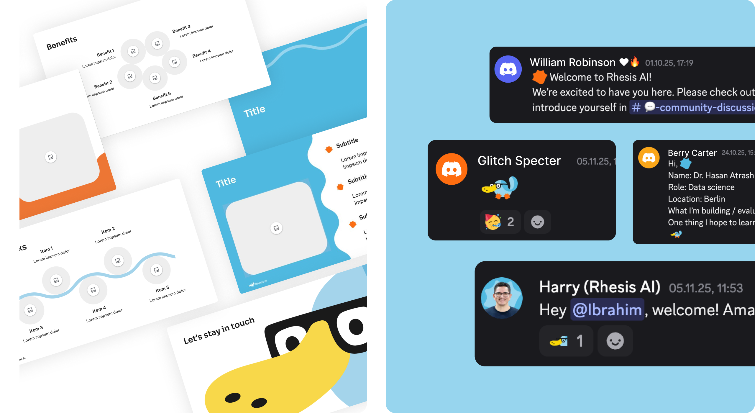
Flexible Brand System
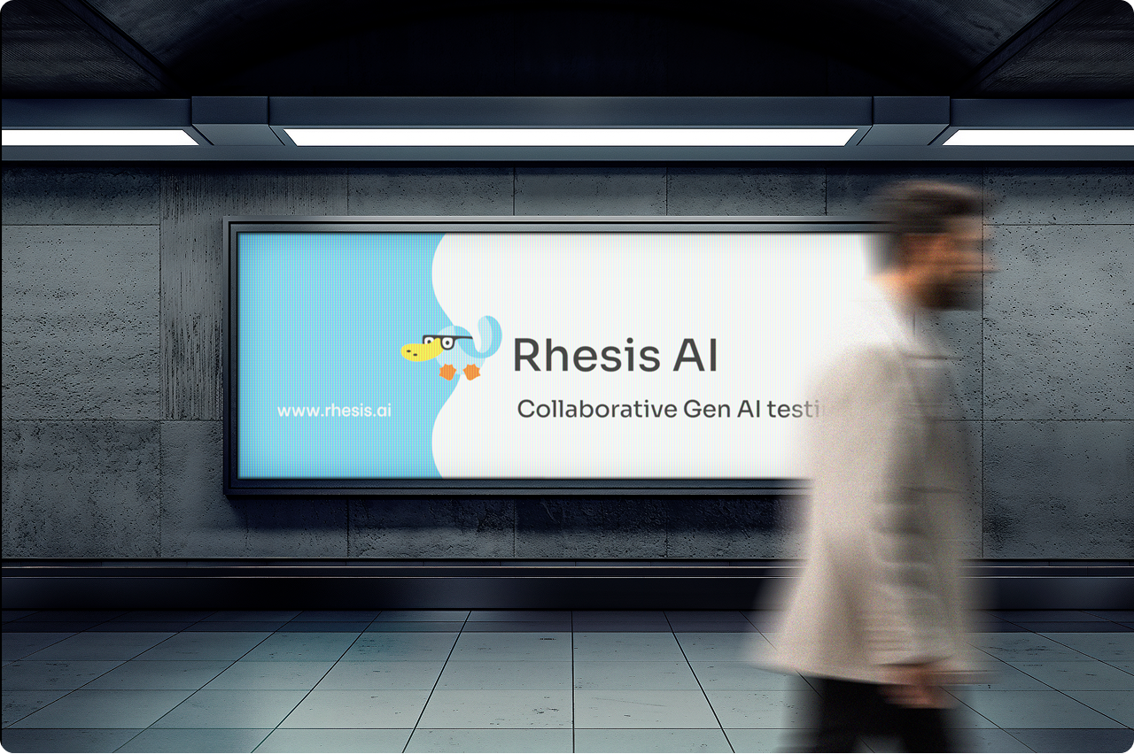
We built a system that gives the Rhesis team room to play with the brand while staying consistent. The result is an identity that feels alive, adaptable, and ready to grow across product, content, community, and future touchpoints.
The end result
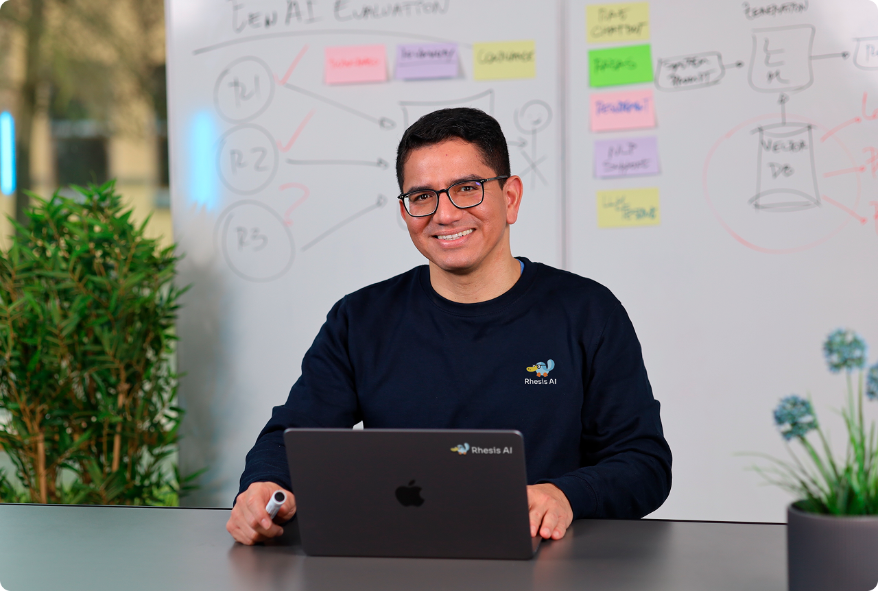
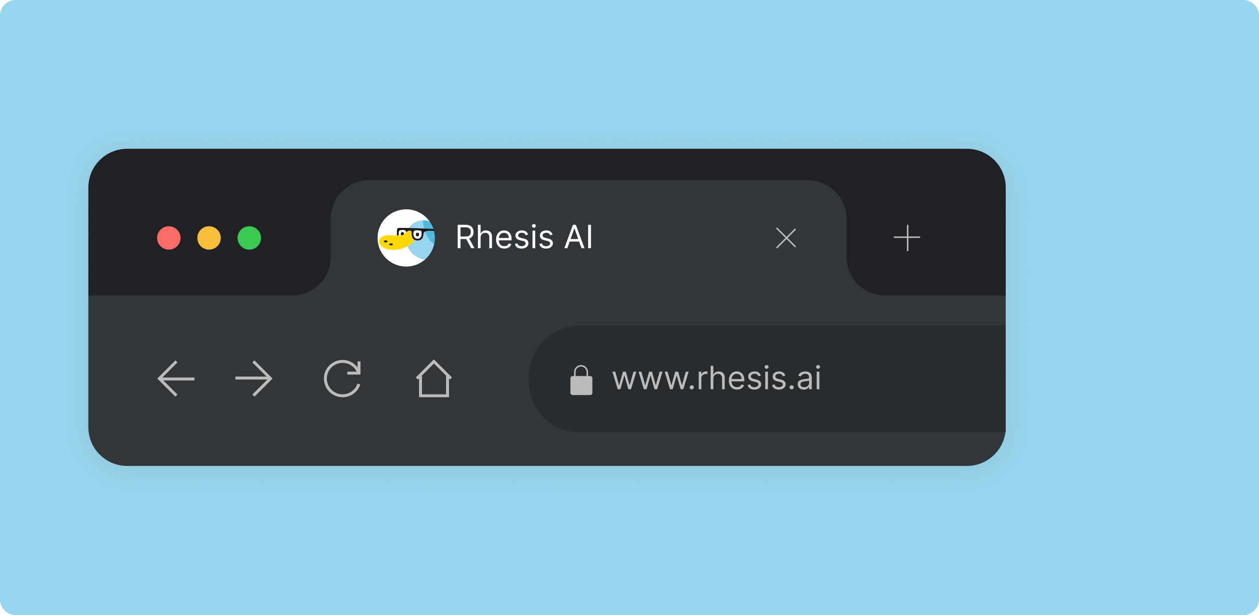
A brand identity that finally reflects the open-source, developer-first company Rhesis had already become.
Results that matter
Clear audience alignment
Stronger distinctiveness
Better brand usability
“An intense journey of creation. We moved from brainstorming, to concepts, to finished brand across different iterations with Gaby and her team at Tukuna Studios. With every workshop, we had to reflect deeply on what we stand for as a brand and in the process, even learned more about our own company. Gaby helped us every step of the way, from asking the right questions, probing, going deeper, and proposing concrete design ideas. The team was flexible, able to adjust whenever we needed speed, as well as when we needed more time, which made the process a lot smoother. Our colleagues and clients were delighted by the results. The deliverables in particular made it super easy for us to integrate the brand into all of our communication. Our mascot, Rheo the Platypus, is the highlight. A big thank you goes to Gaby and the team for the terrific creative work!”


If your brand no longer reflects the people you are building for, it may be time to realign it.
Let’s shape a brand that feels true to your product, your audience, and your ambition.
Explore more