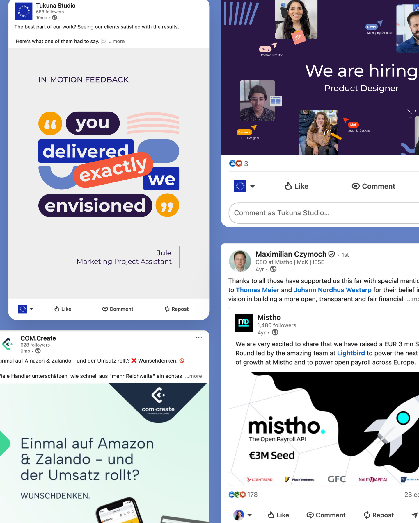
Infographics & Product Visuals
Clear and accurate visuals that help people understand your data, systems, and product without working through dense explanations.

Make complexity easier to understand
Tech companies often need to explain data, workflows, architecture, and product value to people with different levels of technical knowledge. We turn the essential information into focused visuals that can be understood quickly and trusted.
Turn numbers into a story people can follow
We design charts, comparisons, metric highlights, and infographics with clear hierarchy, accurate labelling, and the context needed to interpret them. Your team provides and validates the data. We make it easier to understand.
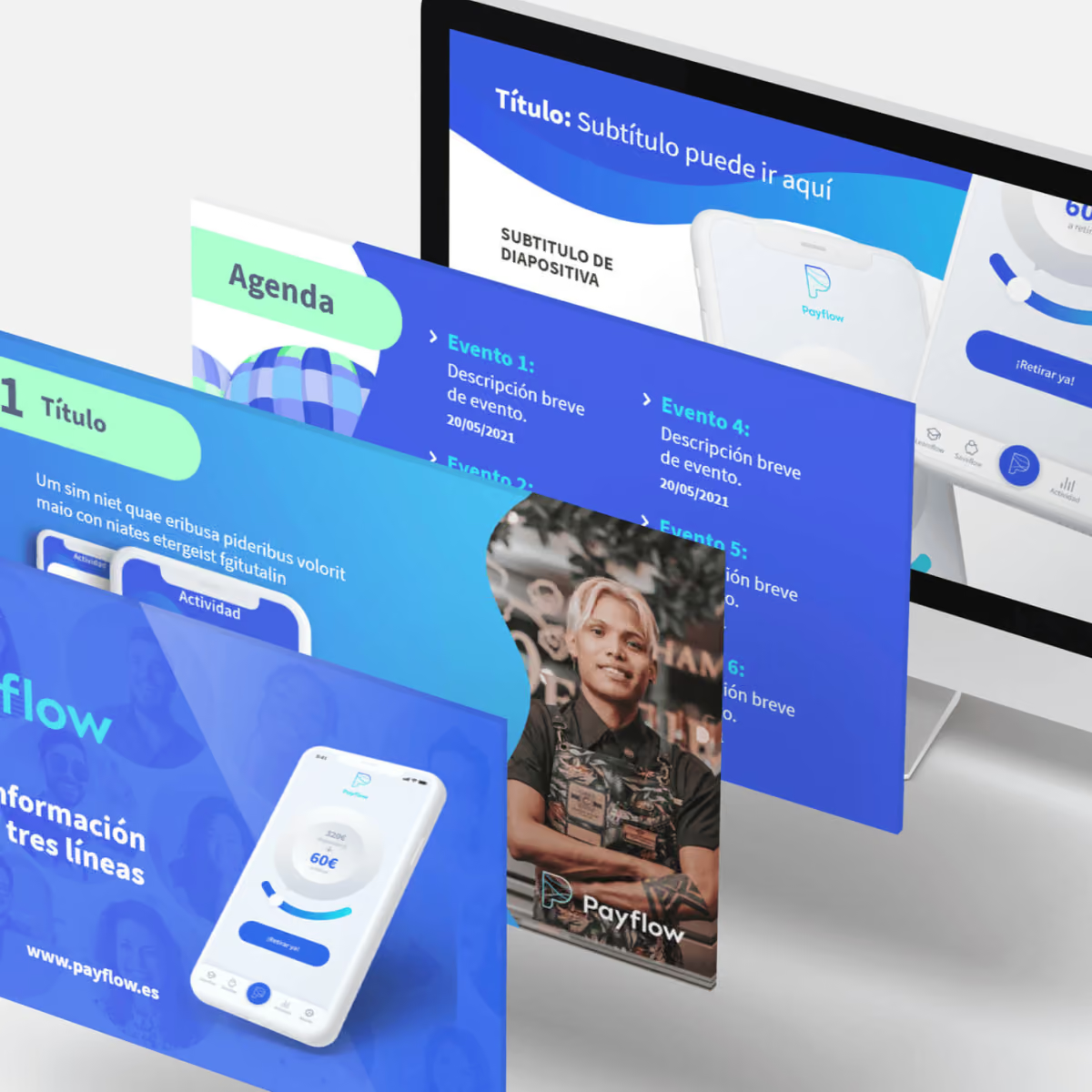
Show how complex parts work together
We translate workflows, architecture, integrations, and technical processes into focused diagrams. We work with your subject experts to simplify the explanation without changing the logic or removing essential detail.
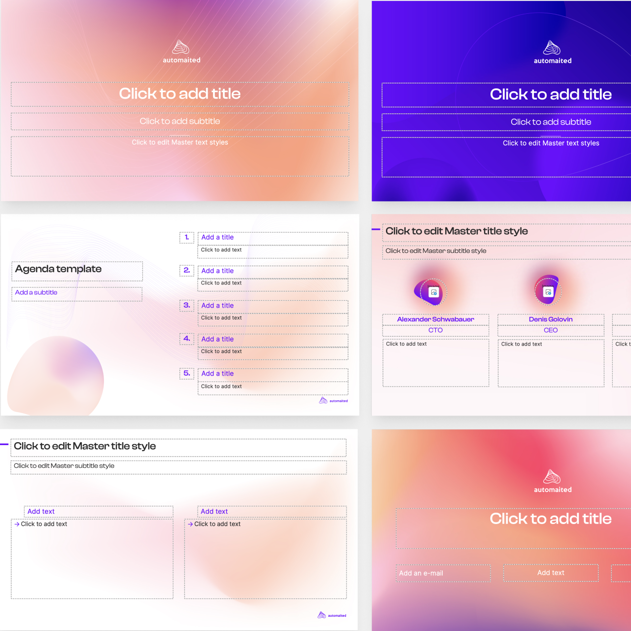
Help people see what your product makes possible
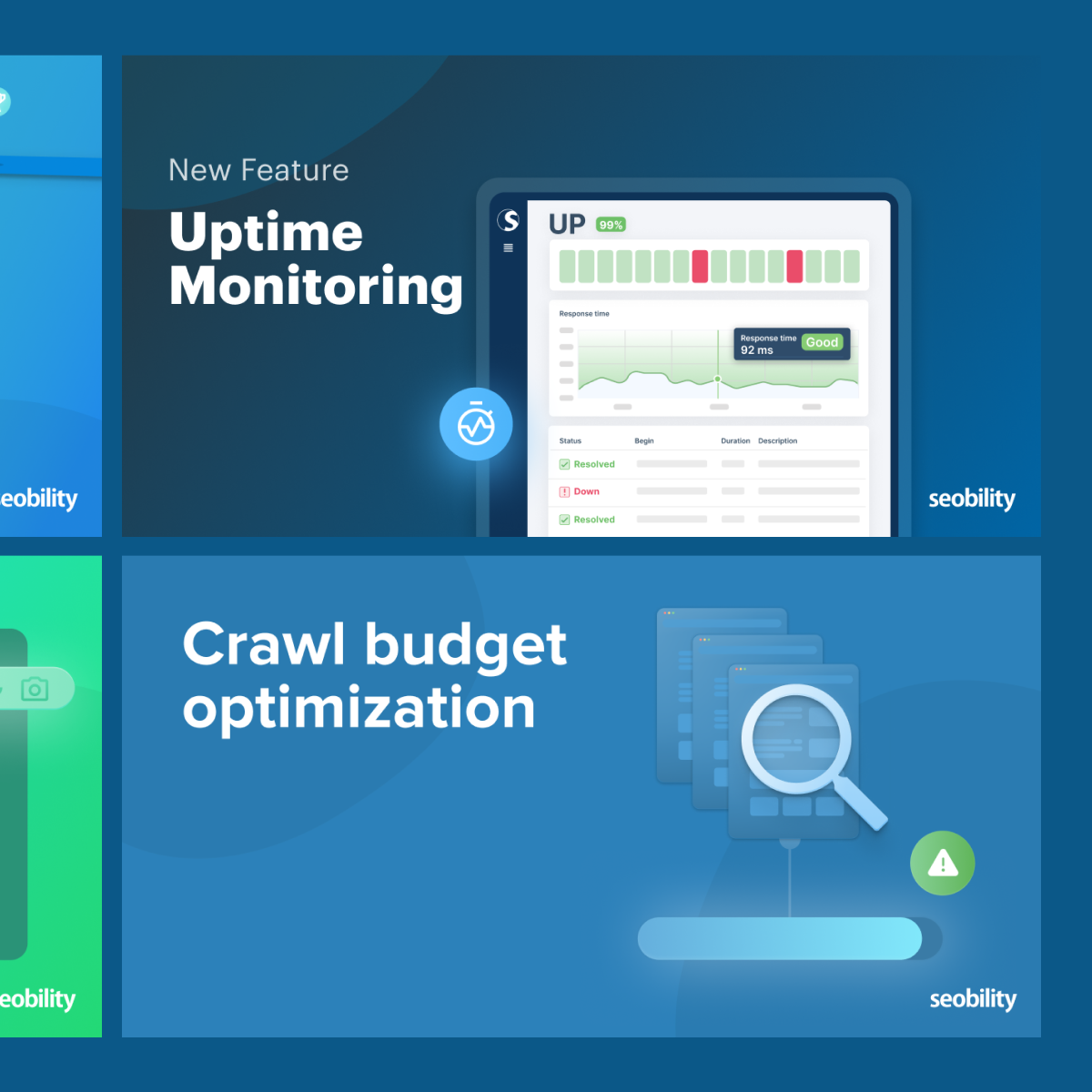
We create interface visuals, annotated screens, feature explanations, and use case graphics that connect product functionality to a clear user benefit across websites, sales materials, launches, and documentation.
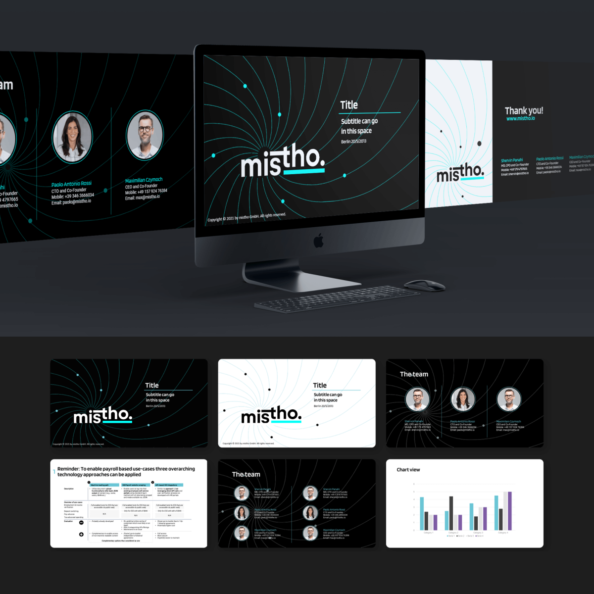

Visual examples

Request this asset
Tell us what your team needs to communicate—whether it is a launch, product update, campaign, event, ongoing content series, or a set of reusable templates. We will recommend the right formats for your channels and workflow.